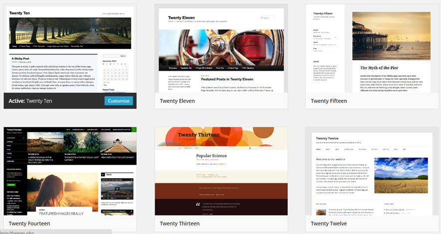
In the first post in this series, we briefly looked at what a theme is and what it does for your blog. Simply put, a theme in WordPress controls the overall look and how information is presented on a blog. The screenshot above shows several themes produced by WordPress. Each year, the organization produces a new theme. By picking a theme from this set, you can be guaranteed that it will be compatible with WordPress and any future upgrades to WordPress.
There are hundreds of other themes also available. Some of these themes are free while others may be used for a fee. Some themes are very flexible and allow you to control the number of columns on the page, menus and submenus, colors, headers, ect. By customizing a theme, you can make your blog distinct from the thousands of other blogs on the web.
But choosing a theme is not purely an artistic choice, You need to think about your audience as well as the content you want to deliver. In my case, I am delivering content to college students whose primary access to the Internet may be a smartphone. Content like equations and graphs may look different on a smartphone versus a laptop because of the narrow size of the smartphone screen. Because of this, WordPress and other theme authors have developed themes that are “responsive”.

The WordPress themes 2014 and 2015 are both responsive themes.
Another term you will see in theme design is fluid layout. The idea behind fluid layout is that the parts of the theme are defined proportionally. The post might take up 75% of the theme width and the sidebar might take up 25% of the width. As the screen size is changed, the proportions defined in a fluid layout will not change. So in theory, the screen would look the same on a 50 inch LED television as well as a smartphone. My experience is that images are not always resized effectively so that they can be read in fluid layouts. before going with any theme, make sure your equations are readable on several different devices like smartphones and tablets.
With responsive layouts, the appearance of the theme depends on the device it is viewed with. In the WordPress theme 2014, my MathFAQ website looks very readable on a laptop (left) and a smartphone (right).
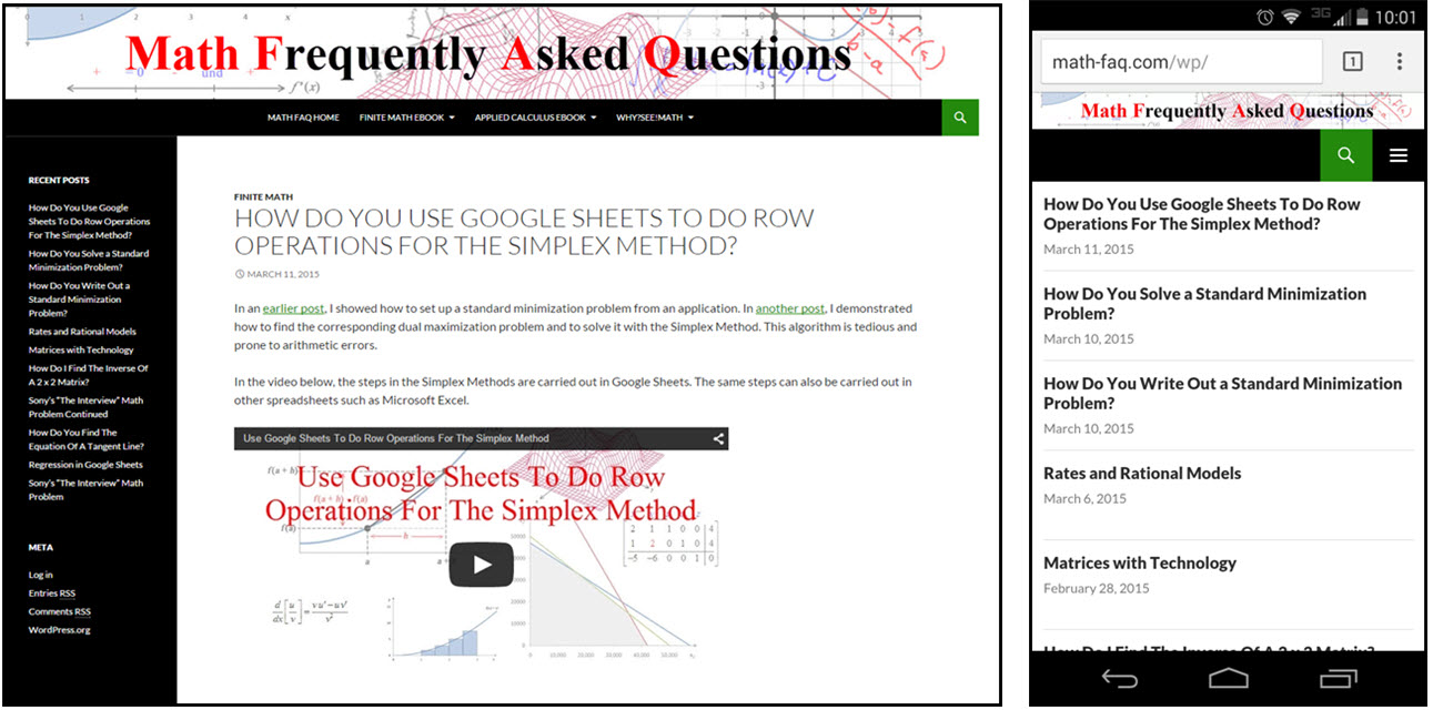
The main difference is the sidebar and the main menu along the top. On a device with a smaller screen, the sidebar appears at the bottom of the page after the posts. The main menu appears under a button to the right of the green search button. Knowing this behavior allows me to adjust what appears in the sidebar. In my case it is a list of recent posts that are not crucial to the overall functionality of the site. Moving it to the bottom does not affect the user experience drastically.
As with fluid layout, you will need to experiment with themes to find the one that works best with your audience and content. My audience consists of students who are using small devices to access the blog. They need to be able to watch videos and view equations on all sorts of devices. It is a good idea to develop a test post of typical content and to make sure it looks readable. Focus on the small devices like tablets and smartphones since students are using that even more with the free access of WiFi on campus.
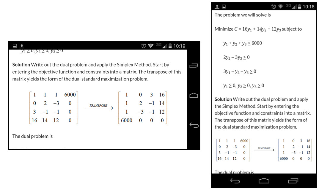
Check the content in landscape (left) and portrait (right) orientations. This helps you to make sure the content looks the way you intend it to on smartphones up to laptops.