What is a bar chart?
On a histogram, the variable being examined is a quantitative variable. This means that each data value is a number. If the variable is a qualitative variable, the data may be represented using a bar chart.
Although a bar chart may look like a histogram, it is quite different. On a bar chart, a bar is drawn corresponding to each value of the quantitative variable. The length of the bar is determined by some numerical measure associated with the data. If the bars on the chart are vertical, the chart is called a vertical bar chart.
In an earlier question, we constructed a frequency table for a customer satisfaction survey at a bank.
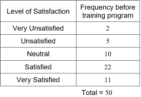
We can construct a vertical bar chart that shows this table in a graphical format.
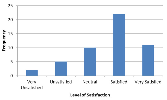
Figure 3 – A vertical bar chart of the results from a customer satisfaction survey.
In the bar chart in Figure 3, the qualitative variable is the level of satisfaction. This variable has five possible values: very unsatisfied, unsatisfied, neutral satisfied, and very satisfied. Above each of these values is a vertical bar whose length corresponds to the frequency at which these values occur in the data.
The same table may also be represented in a horizontal bar chart.
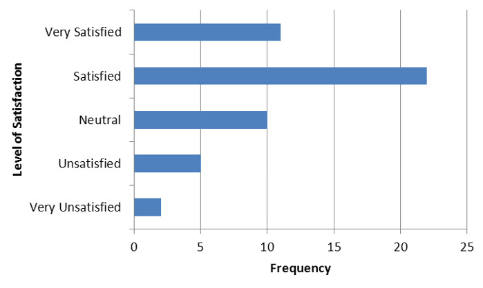
Figure 4 – A horizontal bar chart of the results from a customer satisfaction survey.
These graphs are identical except for the fact that the axes have been reversed. In Figure 4, the values for the qualitative variable are on the vertical axis. The horizontal axis measures the frequency for each of the outcomes from the variable.
A bar chart may be used to display any measurement associated with the qualitative variable.
Example 6 Make a Vertical Bar Chart
Publicly traded companies often return a portion of their profits to shareholders as dividends. Financial statistics usually include the dividend yield of the company. This statistic is calculated by dividing the dividend per share by the price of a share of stock. This ratio reflects the size of the dividend as a proportion of the share price.
The table below shows the dividend yield of the six largest companies in the energy sector on the New York Stock Exchange.
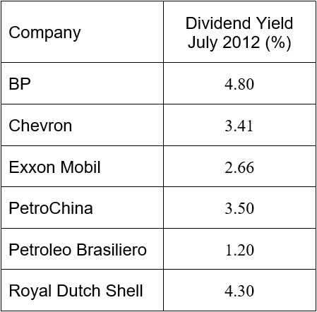
Use this table to represent the dividend yield in a vertical bar chart.
Solution The qualitative variable is the company. The companies are listed along the horizontal axis. For each value, the corresponding dividend yield is measured and graphed vertically.
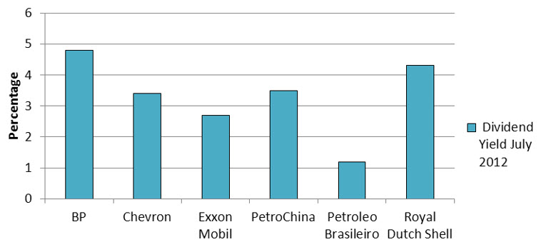
The order in which the values of the qualitative variable is graphed is not important. However, it is very common to use alphabetical order.
The data in Example 6 may also be graphed in a horizontal bar chart. In this case, the companies are listed along the vertical axis. The bars extend horizontally and the lengths are determined by the dividend yield.
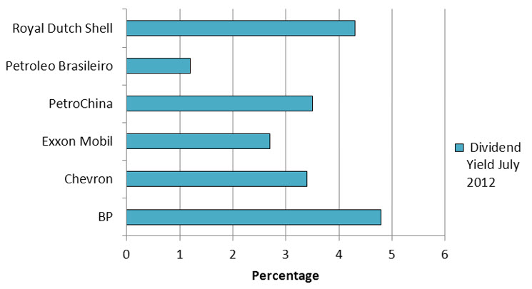
Figure 5 – A horizontal bar chart of the dividend yield for the six largest companies in the energy sector.
Bar charts are very useful for making comparisons with qualitative variables. For instance, we might want to compare the dividend yield of a stock in July of 2012 with its dividend yield in September 2011.
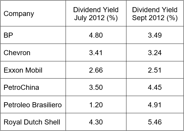
The dividend yield at the two different times are represented with different bars above each company. The length of each bar corresponds to the dividend yield.
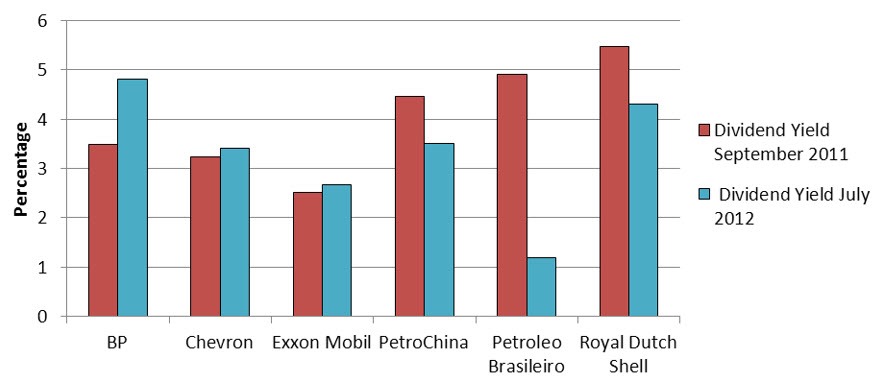
Figure 6 – The dividend yield for the six largest companies in the energy sector in September 2011 and July 2012.
A bar chart like this one makes it easy to spot changes and trends in the data values. It also makes the size of the changes.