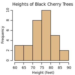
When large amounts of data are collected, we need to be able to spot trends and communicate those trends to audiences. In this section, we will look at how data may be visualized using several types of graphs.
To help us learn how to represent data visually, you will learn how to
- organize data into a frequency table,
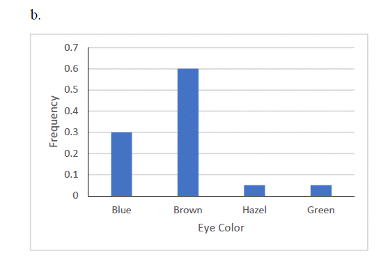
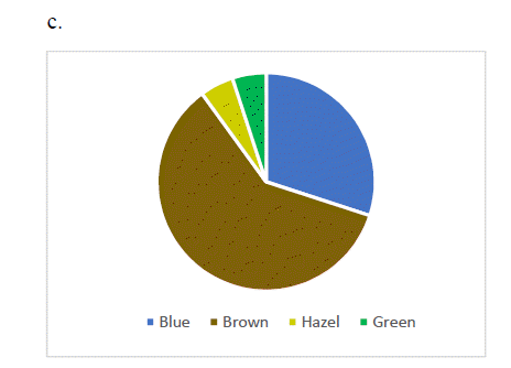
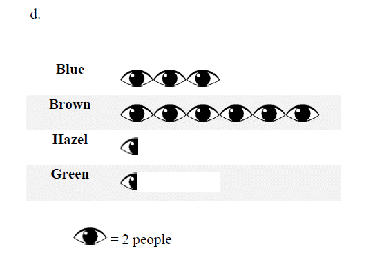
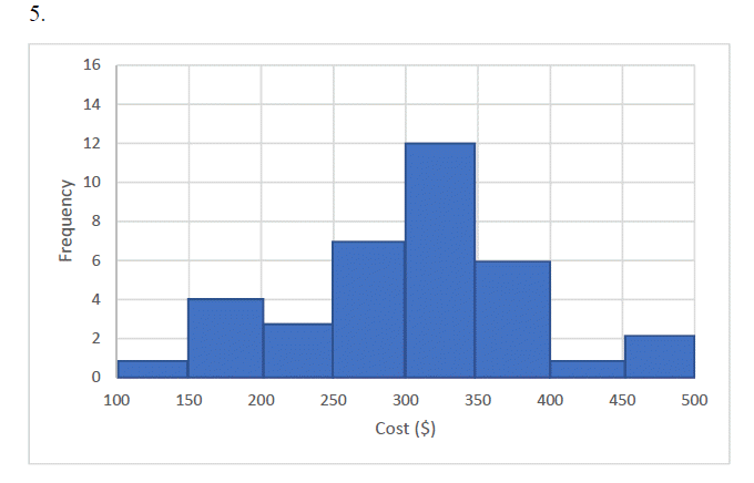
- use an appropriate method to represent data visually,
- compare data using stem and leaf plots.
The workbook and videos below introduce these concepts through a series of questions, guided problems and practice problems. Read through the guided problems and then complete the practice problems to help you master the objectives above.
Section 1.3 Visualizing Data (PDF) (7-30-19)
Section 1.3 Practice Solutions
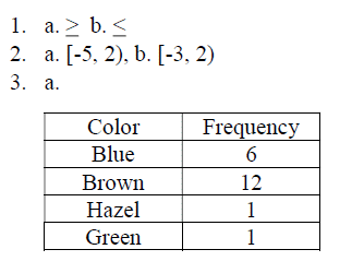
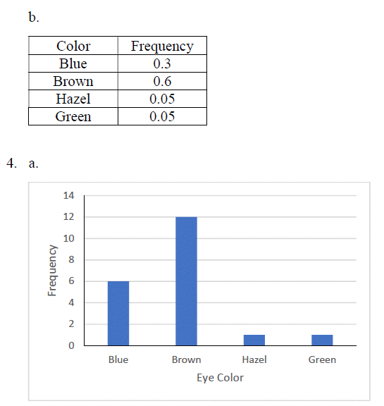
Chapter 1 Practice Solutions (PDF)(7-28-19)
Videos by Mathispower4u by James Sousa is licensed under a Creative Commons Attribution-ShareAlike 3.0 Unported License.
