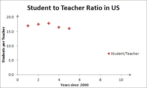
Most students begin graphing the student to teacher ratio in each year. They must calculate these ratios from the NCES data. As an example, the scatter plot of the student to teacher ratio for the entire United States from 2000 to 2006 looks like the graph below.
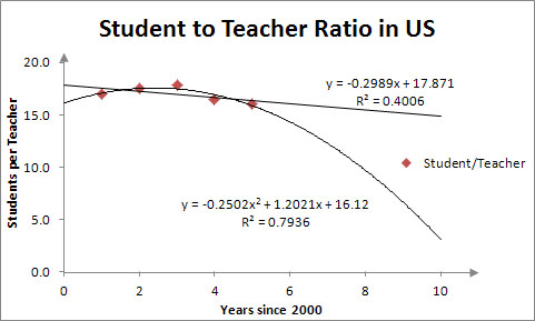
As outlined with the US data, the strategy does not seem difficult to follow. However, each student is only using these graphs as a guide to complete a similar analysis on the state they have been assigned to analyze. Their data may or may not behave the same way as the US data. For instance, in many states the number of teachers is decreasing. Modeling the data with a polynomial leads to a function that will equal zero. The resulting ratio function then has a vertical asymptote. Students must model teachers with a function that is non-negative to eliminate this type of behavior. Most students examine several different options for their ratio to find one that behaves as they expect it should behave based on the data.