

One of my favorite activities in class involves the wireless carrier Verizon. The data for this activity comes from several years of annual reports published on the Verizon website. I have used this data in several contexts. In this post, I’ll demonstrate three of these activities. The first activity I use in the context of average rates of change. This activity is appropriate for a College Algebra or Calculus class. The second activity uses the same data in the context of marginal revenue. Finally, I’ll examine a point of inflection on the revenue at Verizon as a function of the number of wireless connections.
So let’s take a look at the data: 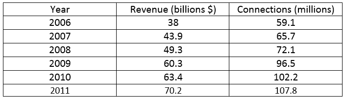 The third column shows the number of wireless connections in the corresponding year from the first column. The second column gives the revenue in each of those years. In College Algebra and Calculus, I have students do a worksheet using this data.
The idea is to get them interested in this data…mentally invested. So I ask them, “Is this a company you might consider investing in? Generally,, I have different groups of students work out the rates over different time periods. For instance, one group might find the change in revenue with respect to time and the change in connections with respect to time over 2006 to 2008. 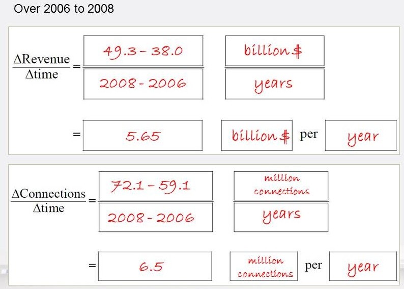 Both rate are positive indicating that the revenue and connections are increasing over time. No doubt the annual reports reported this to investors. A different group might find the same rates over the period from 2008 to 2011.
 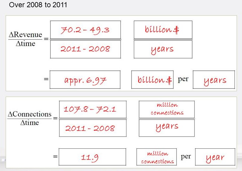 These rates are also positive and even larger than the rates from 2006 to 2008. As an investment, this might seem like an ideal situation. More and more revenue over time and more and more connections over time. Now let’s look at a different rate that compares how the revenue is changing with respect to the connections.
 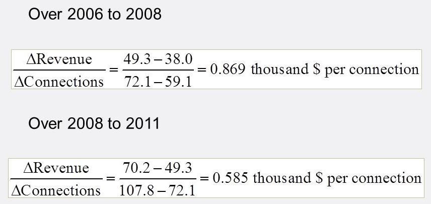 The challenging part of this calculation is the units…billions of dollars divided by millions of connections. Since billion divided by million is one thousand, this rate is in thousands of dollars per connection. Notice that over the earlier period, an additional connection results in an additional $869. However, in the later period this has dropped to an additional $585 for an additional connection. Still positive, but smaller. As an investment, this information might cause you to examine the company’s financial statement much closer. This is the type of activity that leads students to an “Aha!” moment. Cell service is getting cheaper and these rates are consistent with that observation. And if you they think about their own bill, are these numbers in the ballpark of what they are paying? Remember that you need to look at the bill on an annual basis? This same data may also be examined in the context of derivatives. Let’s graph the data as a function of connections.
 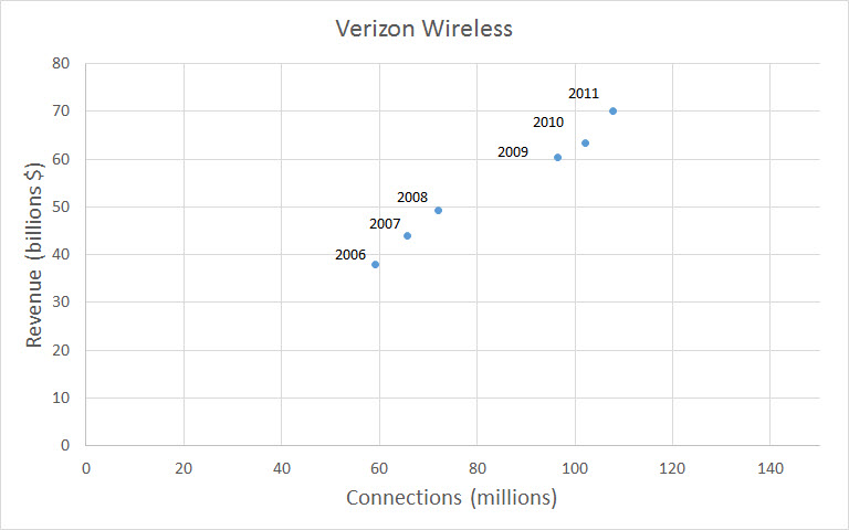 I don’t think you would be surprised to find that a cubic is a nice model for the data.
 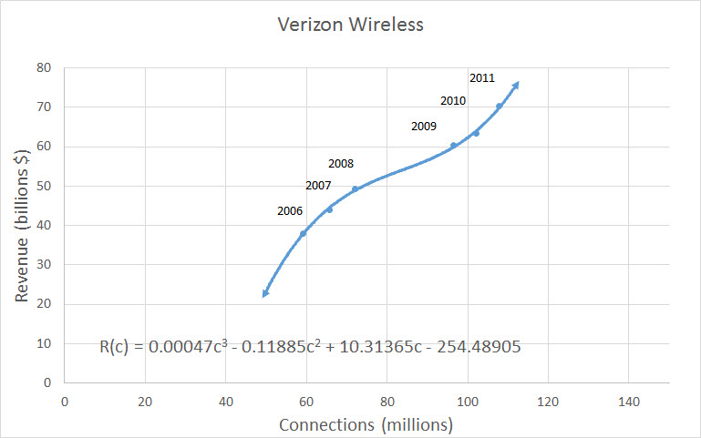 A question that might be asked in a calculus class is, “At what rate is the revenue increasing when there are 80,000,000 connections?” In mathematical terms, we need to calculate R'(80). Getting the scaling correct is often a challenge…it seems as though students read right past the millions and billions in the function unless it is spelled out for them. The derivative is
 ![]() When we evaluate this at c = 80, we get
When we evaluate this at c = 80, we get 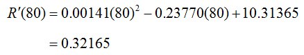 As in the previous example, we need to focus on the units to interpret this rate.
  Adding this to the numerical value gives
 ![]() This means that an additional connection at this level results in an increase in revenue of 0.31265 thousand dollars or $321.65. I’ll bet most of you are curious about the point of inflection on this function…me too. This slightly messy calculation is a step above the basic inflection point calculations. But it also gives a concrete example of what a point of inflection really is. Let’s look at where it might be graphically.
This means that an additional connection at this level results in an increase in revenue of 0.31265 thousand dollars or $321.65. I’ll bet most of you are curious about the point of inflection on this function…me too. This slightly messy calculation is a step above the basic inflection point calculations. But it also gives a concrete example of what a point of inflection really is. Let’s look at where it might be graphically. 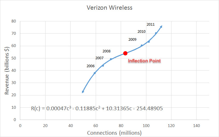 We can see the point of inflection is just past 80 since that is where the function changes from concave down to concave up. The first and second derivative are
 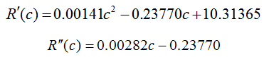 Set the second derivative equal to zero and solve for c to give
 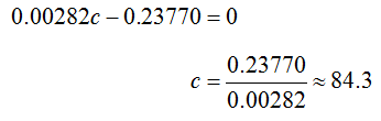 This is consistent with the graph above, but does the concavity really change? Let’s label this point on a number line and track the sign of the second derivative.
 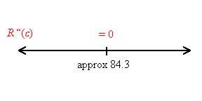 Test the second derivative at 50 and 100:
 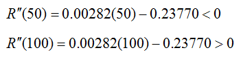 Label these values on the number line.
 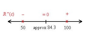 Since the second derivative changes from negative to positive, the concavity changes.
 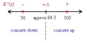 We can locate this point on the graph by evaluating the point of inflection in the revenue function.
 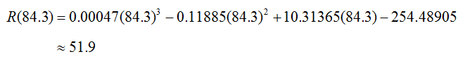 As we had hoped, the information is consistent with the graph. In class, I have my students do all of this work. Once they have completed it, we ask the big question…”Why is this point so important?” I’l
l leave that to you. What I really like about this series of activities is that they continue throughout the semester. It feels like you are really getting to know Verizon and it’s revenue. The bonus is this is not just any old company that they cannot relate to. Chances are that three-quarters of your students will have a Verizon phone in their pocket. In Prescott, Arizona where I live, it is probably closer to 90%. That makes it pretty easy to get their attention. The likelihood of them learning is increased if you briefly review what you know from earlier examples and worksheets regarding the data. In fact, maybe a little quiz beforehand might be given so that they can practice retrieval of the concepts.
In a later post I’ll look at another way you might model this data using rational functions.