On a histogram, the variable being examined is a quantitative variable. This means that each data value is a number. If the variable is a qualitative variable, the data may be represented using a bar chart.
Although a bar chart may look like a histogram, it is quite different. On a bar chart, a bar is drawn corresponding to each value of the quantitative variable. The length of the bar is determined by some numerical measure associated with the data. If the bars on the chart are vertical, the chart is called a vertical bar chart.
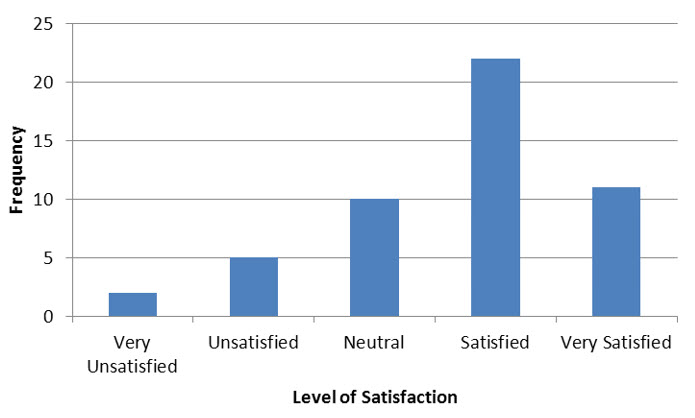
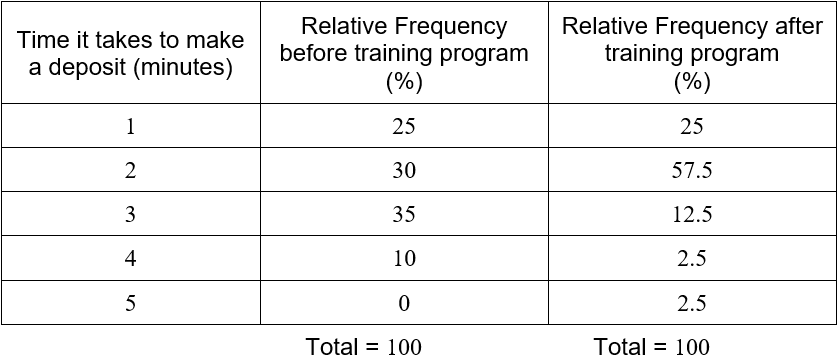
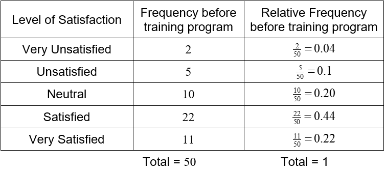
In an earlier question, we constructed a frequency table for a customer satisfaction survey at a bank.
We can construct a vertical bar chart that shows this table in a graphical format.
Figure 3 – A vertical bar chart of the results from a customer satisfaction survey.
In the bar chart in Figure 3, the qualitative variable is the level of satisfaction. This variable has five possible values: very unsatisfied, unsatisfied, neutral satisfied, and very satisfied. Above each of these values is a vertical bar whose length corresponds to the frequency at which these values occur in the data.
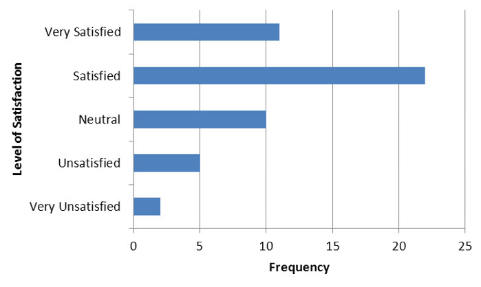
The same table may also be represented in a horizontal bar chart.
Figure 4 – A horizontal bar chart of the results from a customer satisfaction survey.
These graphs are identical except for the fact that the axes have been reversed. In Figure 4, the values for the qualitative variable are on the vertical axis. The horizontal axis measures the frequency for each of the outcomes from the variable.
A bar chart may be used to display any measurement associated with the qualitative variable.
Example 6 Make a Vertical Bar Chart
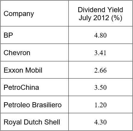
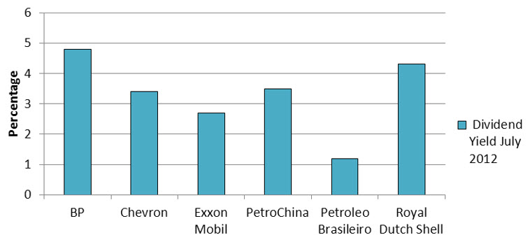
Publicly traded companies often return a portion of their profits to shareholders as dividends. Financial statistics usually include the dividend yield of the company. This statistic is calculated by dividing the dividend per share by the price of a share of stock. This ratio reflects the size of the dividend as a proportion of the share price.
The table below shows the dividend yield of the six largest companies in the energy sector on the New York Stock Exchange.
Use this table to represent the dividend yield in a vertical bar chart.
Solution The qualitative variable is the company. The companies are listed along the horizontal axis. For each value, the corresponding dividend yield is measured and graphed vertically.
The order in which the values of the qualitative variable is graphed is not important. However, it is very common to use alphabetical order.
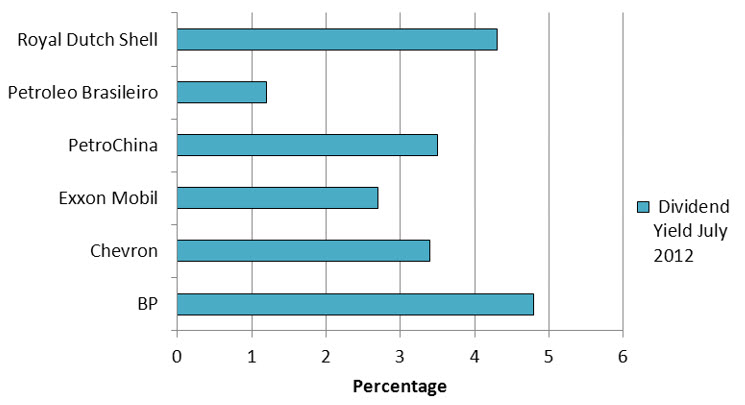
The data in Example 6 may also be graphed in a horizontal bar chart. In this case, the companies are listed along the vertical axis. The bars extend horizontally and the lengths are determined by the dividend yield.
Figure 5 – A horizontal bar chart of the dividend yield for the six largest companies in the energy sector.
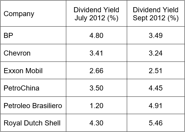
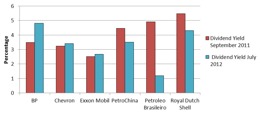
Bar charts are very useful for making comparisons with qualitative variables. For instance, we might want to compare the dividend yield of a stock in July of 2012 with its dividend yield in September 2011.
The dividend yield at the two different times are represented with different bars above each company. The length of each bar corresponds to the dividend yield.
Figure 6 – The dividend yield for the six largest companies in the energy sector in September 2011 and July 2012.
A bar chart like this one makes it easy to spot changes and trends in the data values. It also makes the size of the changes.
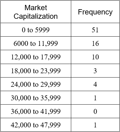
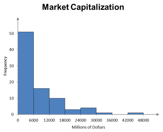
A frequency histogram is a visual representation of the information in a relative frequency table. The classes for the data are shown on the horizontal axis. The frequencies are represented on the vertical axis using rectangular bars.
Figure 1 – A frequency histogram for the market capitalization of selected companies in the energy sector.
Each rectangular bar on the graph spans the class horizontally. The width of the bar is the width of the class. If the classes have equal widths, then each bar has the same width.
The height of the bar is the frequency from the frequency table.
Example 5 Make a Histogram
In Example 4, we made a frequency table for wait times at a bank.
Use this table to make a frequency histogram.
Solution The horizontal axis is labeled with the classes. Above each class is a rectangle whose height corresponds to the frequency for that class.
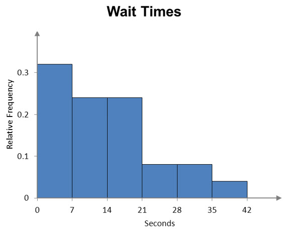
A relative frequency histogram differs slightly from a frequency histogram. In a relative frequency histogram, the relative frequencies are graphed vertically. For Example 5, the relative frequency histogram looks almost identical to the frequency histogram.
Figure 2 – A relative frequency histogram of the wait times at the bank. Note the different vertical scale for relative frequency.
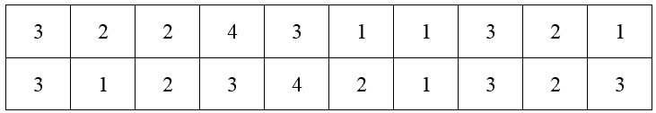
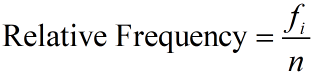
A local bank is interested in tracking the time it takes a customer transaction to be completed. On Monday, they randomly select 20 customers and measure the amount of time it takes each customer to make a deposit. Each data value is rounded to the nearest minute.
Data like this is easy to record. As banks compete for customers, they strive to lower the amount of time it takes a customer to make a deposit.
With only 20 numbers, it might be possible to examine the data and get some useful information about it. As more and more data is collected, the numbers become lost in the sheer amount of information. It is helpful to represent the data differently. A frequency distribution table allows us to see the different data values and how frequently they occur. The data in the table above are discrete data. This means they only take on a few values. In this case, the data only takes on the values 1, 2, 3, or 4. The frequency distribution table is constructed by counting the number of times each data value occurs. These frequencies are then listed with the corresponding data value in a table.
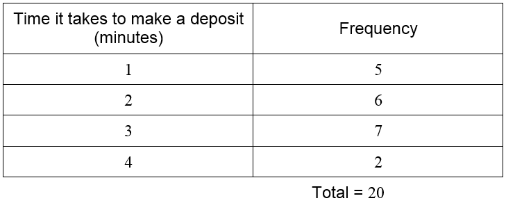
For instance, the data value 1 occurs 5 times in the table. The data value 2 occurs 6 times, 3 occurs 7 times, and 4 occurs 2 times. List these values in a table.
The total is often included to insure that all data values have been included in the count. Looking at the table, we see that the time of 3 minutes occurs most frequently. In fact, almost all deposits take 3 minutes of less.
Example 1 Find the Frequency Distribution Table
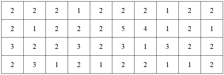
The bank develops a new training program to help make each teller more efficient. After all tellers have completed the training program, the bank measures the amount of time it takes 40 randomly selected customers to make a deposit. These times are recorded in the table below.
Construct a frequency distribution table for the data.
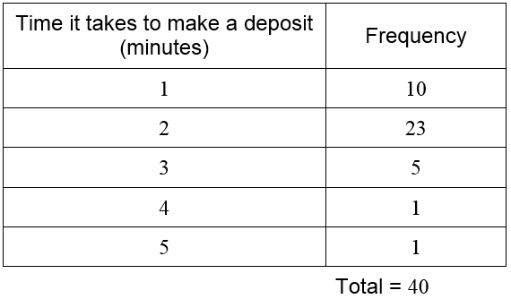
Solution The data in this table takes on the values 1, 2, 3, 4, and 5. We will need rows in the frequency distribution table for each value. Then count the number of times each value occurs and record the frequency.
The frequencies add to 40 so we have included all of the times in the table. Without this total, we would not know if we miscounted the data values.
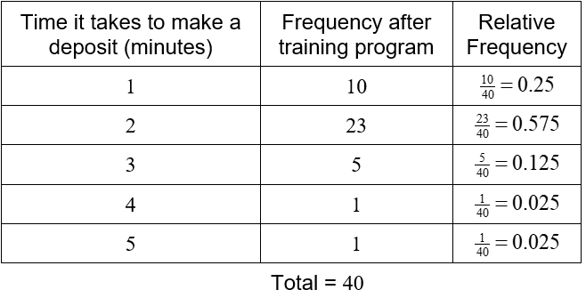
Let’s compare the two frequency distribution tables we have created. Add another row to the first table for a deposit taking 5 minutes, but with a frequency of zero.
Since the totals for each table are different, it is harder to make a direct comparison of the tables. This is remedied by computing the relative frequency of each data. The relative frequency is computed by dividing each frequency by the corresponding total number of measurements.
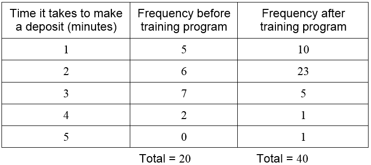
To help us develop a framework for working with discrete data, suppose there are kdifferent data values with k corresponding frequencies. In the case of the bank data, there are five different data values (1, 2, 3, 4, 5). We refer to any individual data value as xi where i can take on the values one through five. The frequencies are referenced as fi. For instance, we would call the first data value, 1, using x1. The corresponding frequency (either 5 or 10 depending on whether we are using the data before or after the training program) is f1. Using this notation, the sum of the frequencies for the first set of data is
For larger numbers of data values, writing a sum in terms of each individual frequency is cumbersome. Sigma notation is used to symbolize a sum. In this case, we would write
The Greek letter sigma (∑ ) is used to indicate a sum of some type. The individual terms of the sum are fi where i takes on the values 1 through 5. This notation may seem a little excessive for only five data values, but it comes in handy when you have 10 or more data values.
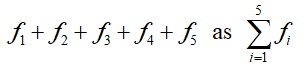
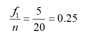
The relative frequency for the first data before the training program is
where n is the total number of measurements. Doing a similar calculation for the other frequencies before the training program gives us the table below.
The relative frequency is highest for a 3 minute deposit with 35% of the deposits taking this time. Ten percent of the deposits take 4 minutes. These percentages enable us to compare the data to other sets of data that may have a different number of measurements.
Suppose a dataset contains k different values x1, x2, …, xk. Each data value xi occurs fi times in the data set. The relative frequency of the data value xi is
where n is the total number of measurements in the dataset.
Since the sum of the frequencies is the total number of data measurements, the sum of the relative frequencies is 1.
Example 2 Find the Relative Frequency Table
Make a relative frequency table for the time it takes to make a deposit after the training program.
Solution The data values are the deposit times. To create the relative frequencies, divide each frequency by the sum of the frequencies.
The relative frequency table allows us to see how frequently each data value occurs. For this purpose, the relative frequency may be written as a percentage instead of a decimal. This is done by multiplying the decimal by 100. This means that the totals in each column will be 100 instead of 1.
From the relative frequencies, we see that deposits taking 3 or 4 minutes prior to the training program are reduced after the training program. This results in an increase in deposits taking 2 minutes. In fact, deposits taking 2 minutes or less increased from 55% of deposits (25 + 35) to 82.5% (25 + 57.5) of deposits.
The time it takes to make a deposit is an example of quantitative data. This means that the data value is a number. In this case, the data values were times in minutes. A relative frequency table may also be computed using qualitative data. Qualitative data describes some attribute of an occurrence.
Suppose a customer satisfaction survey is administered to the customers exiting the bank. The survey asks the customer to rate their satisfaction with their visit as very satisfied, satisfied, neutral, unsatisfied, or very unsatisfied. Based on this survey, the following frequencies are calculated.
The sum of the frequencies is higher since the survey also encompasses customers who utilized services other than making a deposit. Even though the data are not numbers, we can still use the frequencies to compute relative frequencies.
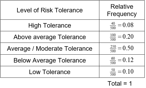
Example 3 Find a Relative Frequency Table
An investment firm administers a survey to its clients to determine their risk tolerance. Based on this survey, the firm puts each of their 500 clients into one of five categories. The table below reflects these results.
Make a relative frequency table for this data.
Solution For each level of risk tolerance, divide the frequency by the total number of clients. This give the following relative frequency table.
A variable that only takes on a finite number of values is called a discrete variable. In each of the previous examples, the number of possible data values for the variable was small. This meant the frequency tables only needed a few rows. If a variable takes on many values, we need additional rows corresponding to each value the variable may take.
Continuous variables may take on any value over an interval. Examples of this type of variable are weight and length. If we were to make a frequency distribution for a continuous variable, the table could potentially have a huge number of rows since every data value might be different.
Discrete variables with many different data values or continuous variables may be displayed in a meaningful way using a grouped frequency distribution. In this type of frequency distribution, each data value is sorted in a category or class. This allows us to calculate the frequency which data values fall into the class.
Let’s look at a concrete example.
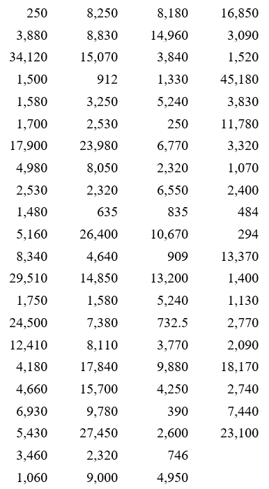
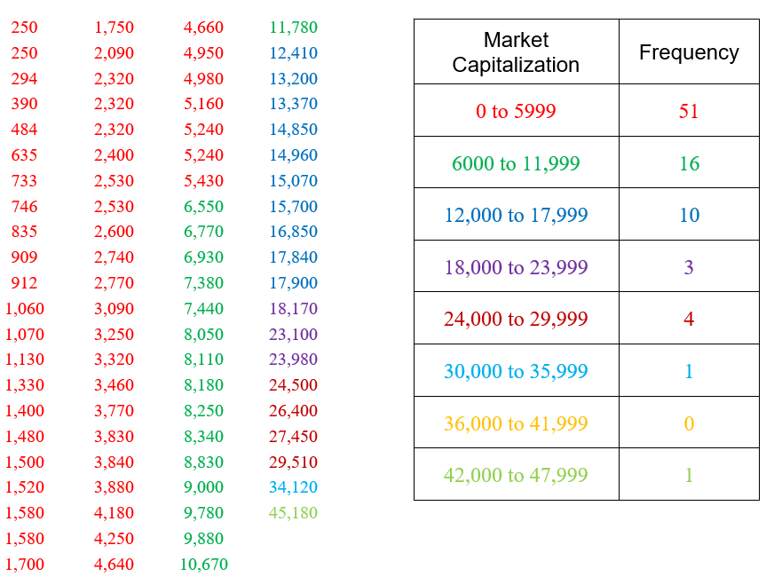
The table above corresponds the market capitalization (in millions of dollars) of 86 companies in the energy sector of the New York Stock Exchange on July 7, 2012. The market capitalization of a company is the value of all shares for the company.
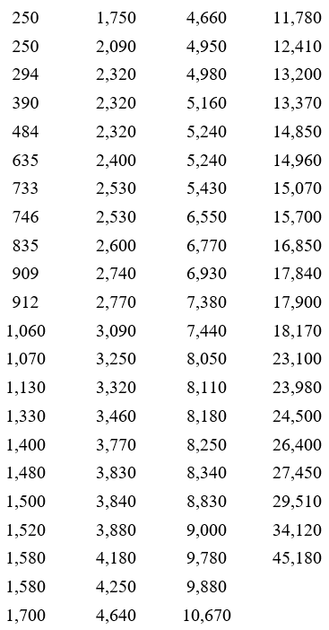
To create a grouped frequency distribution, we start by sorting the data from smallest to largest.
This sorted list, called a data array, shows the smallest market capitalization in the upper left. The market capitalization increases as you move down and to the right in the table.
Now we must define the classes to which each of these data should be placed in. The classes must be defined so that each data value falls into only one of the classes. For these companies, the market capitalizations all fall from 250 through 45,180. This means that the values cover a range of values 45,180 – 250 or 44930 wide. In general, we use between 5 and 15 classes. If possible, we also use classes that are of equal width to make it easier to compare relative frequencies.
Let’s try 8 classes for this data. Each class must have a width of about 44930/3 . This is not a very nice number so we round up to the next convenient value like 6000.
The width of a class is
We could start at 250 with classes that are 6000 wide. However, if we start at 0 and use eight classes that are 6000 wide we will include all of the data values.
The classes above do not overlap and insure that each data value will fall into one of the classes. The second number in each class is chosen carefully to insure the classes contain all data values. In this case, each value is rounded to the nearest integer when calculating the frequency. If all of the data had been written to the hundredths place, we would also want to write the classes to the nearest hundredth. Now we’ll scan the table and calculate the frequency for each class.
We have color coded the appropriate numbers in the table to make them easier to count. Strategies like this help to insure that all values are accounted for and put into the correct class.
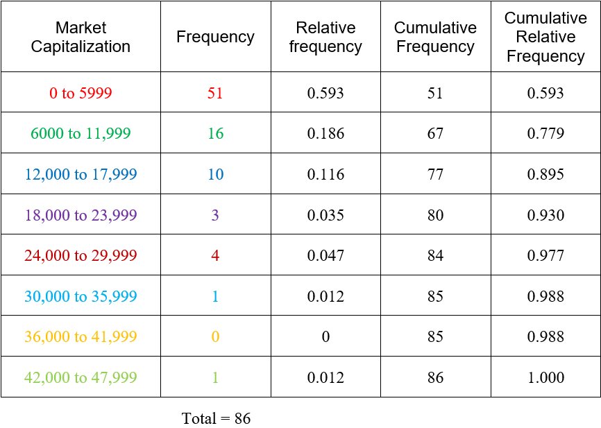
Once we have the frequencies, we can calculate the relative frequencies.
Due to rounding, the sum of the relative frequencies exceed 1 by a small amount. This table also includes the cumulative and cumulative relative frequency. The cumulative frequency of a class is the number of data values that are less than the upper boundary of the class. For instance, the cumulative frequency for the market capitalization from 12,000 to 17,999 is the number of companies whose market capitalization is 17,999 or less. This frequency is simply the sum of the frequencies for the class from 12,000 to 17,999 and all of the frequencies for the classes below it or 51 +16 + 10 = 77. The cumulative relative frequency is found by dividing the cumulative frequency by the total. For the class from 12,000 to 17,999, this gives us 77/85 ≈ 0.895. This tells us that approximately 89.5% of the companies have a market capitalization of 17,999 million dollars or less.
Example 4 Grouped Data
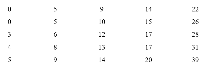
The manager at a bank monitors the amount of time a customer spends in line waiting for a teller. They record this value, in seconds, for 25 customers on a Friday afternoon.
a. Use this data to make a table that includes a column for the relative frequency and the cumulative relative frequency. Use 6 classes to group the data.
Solution Start by putting the data in order.
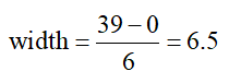
The class width is
We will round up to a width of 7 and sort the data into the classes below. These classes include all times in the data and do not overlap.
In this table the relative frequencies are calculated by dividing the frequencies by 25. The cumulative frequencies are determined by finding the wait times that are below the upper limit in the class.
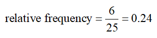
b. What proportion of the wait times are at least 14 seconds, but less than 21 seconds?
Solution The relative frequency for the class from 14 seconds to under 21 seconds is the proportion of wait times in the class 14 to under 21:
This means 24 percent of the wait times are 14 minutes to under 21 minutes.
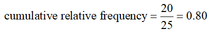
c. What proportion of the wait times are less than 21 seconds?
Solution The cumulative relative frequency for the class from 14 to under 21 minutes is the proportion of wait times less than 21 minutes:
This means 80 percent of the wait times are less than 21 minutes.
How will changes in the objective function’s coefficients change the optimal solution?
In the previous question, we examined how changing the constants in the constraints changed the optimal solution to a standard maximization problem. Such modification led to a different feasible region and changes to the optimal solution.
In this question, we examine how changes in the coefficients of the objective function change the optimal solution. If one of the coefficients of the objective function increases or decreases, the feasible region remains the same. Since the feasible region is defined by the constraints and not the objective function, there are no changes to the corner points. A change in one of the coefficients changes the slope of the isoline, the line that corresponds to setting the objective function equal to a constant.
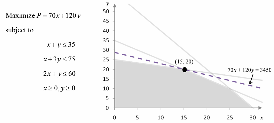
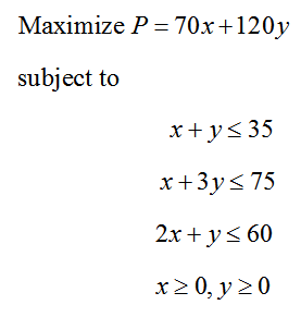
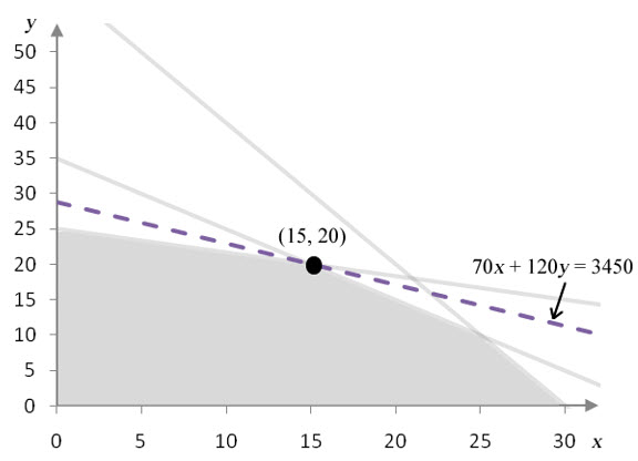
Let’s recall the problem we have been analyzing:
Figure 10 – A standard maximization problem and its corresponding feasible region.
The objective function takes on the optimal value P = 3450 at the corner point (15, 20). The isoprofit line 70x + 120y = 3450 just touches the feasible region at that point verifying this assertion.
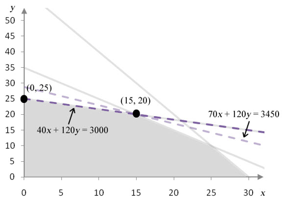
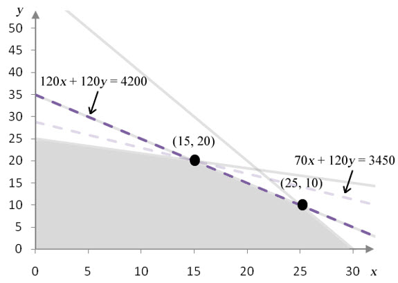
Now let’s try increasing and decreasing the coefficient on x in the objective function.
Figure 11 – This graph shows the feasible region with the isoprofit line at the optimal solution (gray dashed line) and the isoprofit line for the optimal solution in the modified problem (purple dashed line). The coefficient on x has decreased from 70 to 40.
As the coefficient on x is decreased, the isoprofit line for the optimal solution gets less steep. At a value of 40, the isoprofit line passes through (0, 25) and (15, 20). At this point, the isoprofit line forms the border of the feasible region there so all points on the line between (0, 25) and (15, 20) yield the same maximum profit. If the coefficient is decreased to a value less than 40, (15, 20) is no longer part of the optimal solution.
Figure 12 -This graph shows the feasible region with the isoprofit line at the optimal solution (gray dashed line) and the isoprofit line for the optimal solution in the modified problem (purple dashed line). The coefficient on x has increased from 70 to 120.
As the coefficient on x is increased, the isoprofit line for the optimal solution gets steeper. At a value of 120, the isoprofit line passes through (0, 25) and (25, 10). The isoprofit line forms the border of the feasible region there, so all points on the line between (0, 25) and (25, 10) yield the same maximum profit. If the coefficient is increased to a value greater than 120, (15, 20) is no longer part of the optimal solution.
As long as the coefficient on x in the objective function falls between 40 to 120, the optimal solution includes (x, y) = (15, 20). If the coefficient is equal to 40 or 120, any ordered pair on a line connecting (15, 20) to one of the adjacent corner points is optimal. However, if the coefficient on x falls outside of 40 to 120 the optimal solution moves to a new corner point.
Recall that the coefficient on x in the objective function is the profit for each frame bag. If the profit per frame bag were to increase by up to $50 (to $120) or decrease by up to $30 (to $40), the optimal solution would not change. This solution, 15 frame bags and 20 panniers, is fairly insensitive to changes in the coefficient on x. Even though the location of the optimal solution does not change over this range, the profit does not change. Notice that we are only varying one coefficient at a time. Varying both coefficients simultaneously is beyond the scope of this presentation.
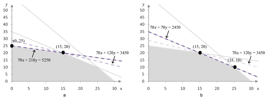
Example 3 Find the Range of Values For Which a Corner Point Remains Optimal
The coefficient on y in the objective function for the linear programming problem
can be varied to find a range of values over which (15, 20) is the optimal solution. Over what range of coefficient values will (15, 20) remain optimal?
Solution Let’s examine the graphical solution for this linear programming problem.
From the earlier discussion on varying the coefficient on x, we observed that changing the coefficient causes the slope of the isoprofit to change. If the slope of the isoprofit line increases so that it coincides with the constraint x + y ≤ 35, the optimal solution is all points on the line connecting (15, 20) and (25, 10). If the slope of the isoprofit line decreases so that it coincides with the constraint x + 3y ≤ 75, the optimal solution is all point on the line connecting (15, 20) and (0, 25).
Figure 13 – In a, the coefficient on y in the objective function has been increased from 120 to 210. In b, the coefficient on y has been decreased from 120 to 70.
As long as the coefficient on y falls in the range 70 to 210, the solution (15, 20) is optimal. Outside of this range, (15, 20) is no longer optimal. If we can determine the coefficient values that cause the isoprofit line to fall on the binding constraint borders, we know the range of values over which the solution remains optimal.
In Figure 13a, the constraint border x + 3y = 35 and isoprofit line 70x + 210y = 5250 coincide. Notice that on each line, the coefficient on y is three times as large as the coefficient on x. Because of this, both lines have the same slope. We can always use this information to find the values of any missing constraints.
For instance, to find the coefficient on y in the objective function that makes its slope the same as the slope on x + y = 35, we can observe that the coefficients must be the same. Therefore, the coefficients in the objective function must be the same. Since we have fixed the coefficient on x and are only varying the coefficient on y, we conclude that isoprofit lines for P = 70x + 70y are parallel to the constraint border x + y = 35. In particular, the isoprofit line 70x +70y = 2450 is exactly the same line.
Putting this together, we observe that the coefficient on y can range from 70 to 210 and the corner point at (15, 20) is optimal.
How will changes in a constraint’s constant change the optimal solution?
To help us answer this question, let’s develop a new application. Unlike earlier applications of the Simplex Method, this application will be an oversimplified example to make the sensitivity analysis easier to understand. Once we have developed and solved this application, we’ll examine how the optimal solution changes when we change the constants on the right hand side of the constraints.
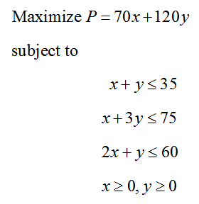
Example 1 Solve the Standard Maximization Problem
A custom manufacturer of bicycle accessories produces two types of bags which can be mounted on a bicycle. Frame bags are mounted in the interior frame of a bicycle, and panniers are mounted on a rack over the rear wheel of a bicycle. Each of these products is built to the measurements of the customer’s bicycle and involves a large outlay of employee labor.
The manufacturer has enough materials on hand to produce a total of 35 frame bags and panniers each week. Several employees produce these products. Two employees are able to dedicate 75 hours each week to cut the fabric for these products, and two other employees are able to dedicate 60 hours each week to assembling and packing the products.
Each frame bag takes employees one hour to cut the fabric and two hours to assemble and package. Each pannier takes employees three hours to cut the fabric and one hour to assemble and package. If the profit from each frame bag is $70 and the profit from each pannier is $120, how many units of each product should the manufacturer accept to insure that profit is maximized?
Solution Assume this manufacturer can pick and choose which orders to accept so that it is able to maximize profit by allocating its resources most efficiently. The basic question we must answer is how many frame bags and how many panniers will be produced so that the profit is as large as possible? This indicates the variables should be defined as
x: the number of frame bags produced each week
y: the number of panniers produced each week
Each frame bag generates $70 of profit, and each pannier generates $120 of profit. We can use this information to write the total profit P as
P = 70x + 120y
If the amount of materials and labor is unlimited, the manufacturer can produce an unlimited number of frame bags and panniers for an unlimited amount of profit.
However, this manufacturer has a limited amount of materials and labor available. The total number of frame bags and panniers that can be produced in a week is 35. Since the variables describe the individual numbers of each product, we know that
x + y ≤ 35
The total number of labor hours available for cutting fabric is 75 hours. This total relates to the individual amounts of time required to cut frame bags (1 hour per frame bag) and panniers (3 hours per pannier). By multiplying the amounts per product by the variables, we get the amount of cutting time for x frame bags, 1x, and the amount of cutting time for y panniers, 3y. The constraint
x + 3y ≤ 75
indicates that the total amount time required to cut the material must be less than or equal to 75 hours.
The same type of reasoning for assembly and packaging yields the constraint
2x + y ≤ 60
Putting the constraints and objective function together with non-negativity constraints yields the standard maximization problem,
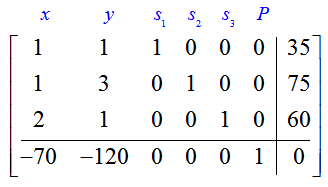
The initial simplex tableau for this linear programming problem is
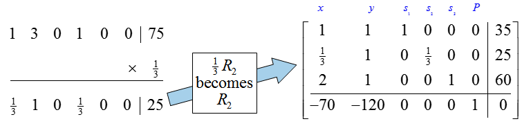
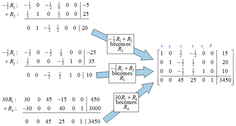
The pivot for this matrix is the 3 in the second row and second column. To change this entry to a 1, multiply the second row by 1/3:
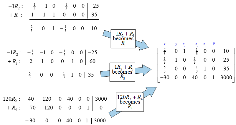
To complete the first iteration of the Simplex Method, we need to use row operations to fill the rest of the second column with zeros.
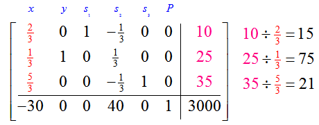
Since the indicator row contains a negative entry in the first column, we need to choose a new pivot.
The first column is the pivot column. Let’s examine the quotients to determine the pivot row:
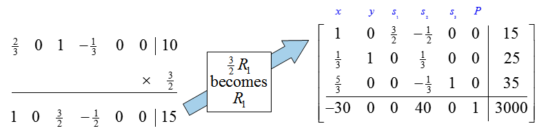
The lowest quotient, 15, is formed from the last column and the pivot column occurs in the first row so we’ll pick the pivot to be the 2/3 . Multiply the pivot row by 3/2 to create a 1 in the first row, first column:
Next, use row operations to create zeros below the pivot.
Since the indicator row contains no negative numbers, we can use this tableau to read the optimal solution.
If we cover the nonbasic variables,
we see that the optimal solution is x = 15, y = 20. This means the largest profit, $3450, occurs when 15 frame bags and 20 panniers are produced each week.
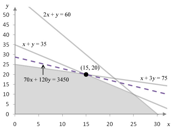
Since this problem contains two decision variables xand y, we can also solve this problem graphically.
Figure 1 – The feasible region for Example 1.
Figure 1 shows the feasible region corresponding to the constraints for the linear programming problem. The dashed line corresponds to the isoprofit at P = 3450. Any profit higher than $3450 pushes the isoprofit outside of the feasible region, and any lower pushes it inside the feasible region. The solution pictured here, (15, 20), is the greatest profit in the feasible region.
In Example 1, the Simplex Method and the graphical method for solving the linear programming problem both indicate that 15 frame bags and 20 panniers should be produced to achieve a maximum profit of $3450. The question we want to examine now is what would happen if the linear programming problem were changed slightly. For instance, what would happen if the constants in any of the constraints were to change?
Questions such as this one often arise in business applications since the values in the linear programming problem are estimates. Estimates are subject to error or changing values if operating conditions change for the business. An example would be if another person was utilized to help produce frame bags and panniers. This would clearly impact the number of hours that would be available for cutting, assembly and packaging. Will this change the optimal solution? Will it increase or decrease the profit?
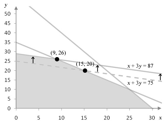
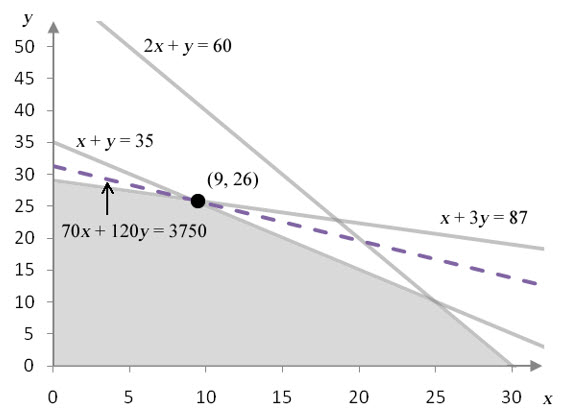
To answer these questions, let’s change the constant in the second constraint. Suppose the number of hours available for cutting increases from 75 to 87. This changes the second constraint in the linear programming problem from x + 3y ≤ 75 to x + 3y ≤ 87. This change does not affect the slope of the line, but it does shift the line up vertically.
Figure 2 – Increasing the number of hours available for cutting shifts the border of the cutting constraint up.
This change moves the corner point at (15, 20) to (9, 26). The corner point matching the optimal solution has moved.
We would expect the optimal solution to change also.
Figure 3 – The solution to the linear programming problem with 87 hours available to cutting.
The corner point matching the optimal solution moves from (15, 20) to (9, 26) when the number of hours for cutting increases by 12 hours. The increased availability of labor increases the profit from $3450 to $3750. The extra 12 hours of labor increases the profit by $300.
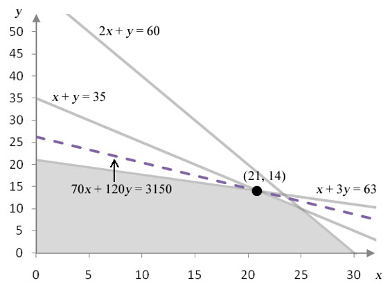
We can also see how the profit changes if the number of hours for cutting decreases by 12 hours. In this case, the constraint x + 3y ≤ 75 becomes x + 3y ≤ 63. In this case, the border of the feasible region shifts down.
Figure 4 – Decreasing the number of hours available for cutting shifts the border of the cutting constraint down.
This change shifts the corner point from (15, 20) to (21, 14). This ordered pair yields the maximum profit of
P = 70 (21) + 120 (14) = 3150
Figure 5 – The solution to the linear programming problem with 63 hours available to cutting.
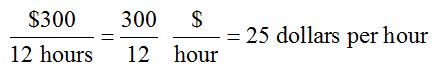
Decreasing the available cutting time from 75 hours to 63 hours reduces the maximum profit from $3450 to $3150. This tells us that each hour the cutting time is reduced, drops the profit by $25.
Whether the cutting time is increased or decreased by 12 hours, the change in profit is $300. Another way to say this is that a change of one hour of cutting time changes profit by $25 since
This value is called the shadow price of the constraint.
The shadow price of a constraint is the amount the objective function changes at the optimal solution when the constant in the constraint is increased by one unit.
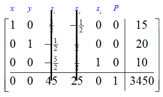
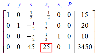
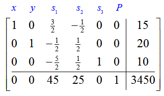
For a standard maximization problem, the shadow price of a constraint appears in the final simplex tableau. Recall the final simplex tableau for this linear programming problem,
The shadow price for the second constraint is located in the fourth column of the indicator row.
Each constraint in the standard maximization problem has a shadow price associated with it. The shadow prices are located in the indicator row of the final simplex tableau beneath the slack variables.
Example 2 Find and Interpret the Shadow Price
The standard linear programming problem from Example 1,
has a final simplex tableau
Suppose amount of material available increased so that an additional 5 frame bags or panniers could be made each week. This will change the first constraint from from x + y ≤ 35 to x + y ≤ 40.
a. Find the shadow price for this constraint.
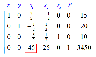
Solution Increasing the amount of available material for a total of 5 more frame bags and panniers changes the first constraint from x + y ≤ 35 to x + y ≤ 40. The shadow price for this constraint is located in the indicator row under the slack variable corresponding to the constraint, s1. In this case, the shadow price is 45.
b. How will profit change when the total capacity to produce frame bags and panniers is increased from 35 to 40?
Solution The shadow price of 45 relates an increase in the constant in the first constraint to an increase in the objective function. This means increasing the capacity to produce frame bags and panniers by 1 unit increases the profit by $45. A five unit increase would increase the profit by five times as much, 5 ($45) = $225.
Shadow prices help us to make informed decisions about changing the resources (the constants in the constraints) for a problem. Knowing the benefits of changing the constant in one of the constraints allow us to decide whether the costs of making this change is reasonable. For instance, if increasing capacity by five units increases profit by $225, but costs $250 to make that change, then the change is not warranted.
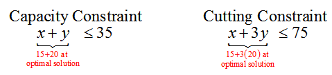
In Example 2, we changed the constant in one of the constraints whose border passed through the optimal solution. Now let’s examine how changing the constant in a constraint whose border does not pass through the optimal solution affects the solution to the linear programming problem. Let’s look the first two constraints at the optimal solution (15, 20):
If the optimal solution is substituted into the left hand side of the first two constraints, the left hand side is equal to the right hand side. This means that at the optimal solution, the entire capacity is being utilized and all of the cutting time is being utilized to produce 15 frame bags and 20 panniers.
This type of behavior defines a binding constraint. At binding constraints, the resources modeled by the constraint are fully utilized.
The same cannot be said of nonbinding constraints. Let’s look at the third constraint at the optimal solution (15, 20):
In this constraint, substituting the optimal solution in the left hand side yields a value of 50. This means that only 50 hours of assembly and finishing time is utilized to produce 15 frame bags and 20 panniers. Ten hours of the available 60 hours for assembly and finishing is not utilized. In the language of linear programming, we say there is 10 hours of slack in this constraint.
If the hours for assembly and finishing are underutilized, adding more time for assembly and finishing will not change the optimal solution.
When the amount of time is for assembly and finishing is decreased by 5 hours, the shape of the feasible region changes. The corner point at (25, 10) moves to (20, 15). At this point, there is still 5 hours of slack, so 5 hours of assembly and finishing time is not being utilized. This has no effect on the optimal solution.
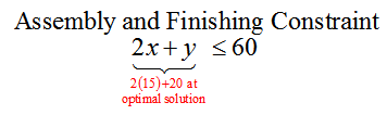
Figure 6 – If the amount of time available for assembly and finishing is reduced by 5 hours to 55 hours, the assembly and finishing constraint shifts down. This moves the corner point at (25,10) to (20, 15).
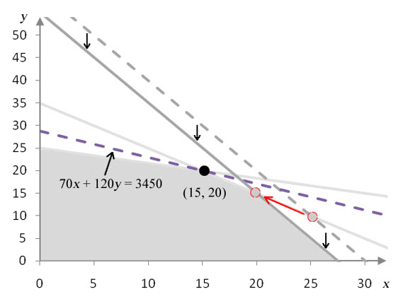
Once the amount of time is reduced by an amount that eliminates the slack, the constraint on assembly and finishing affects the solution. If the amount of time for assembly and finishing is dropped to 50 hours, all three constraints intersect at the same point, and all three constraints are binding. In this case, the capacity, cutting time and assembly and finishing time are fully utilized.
Figure 7 – If the amount of time available for assembly and finishing is reduced by 10 hours to 50 hours, the assembly and finishing constraint shifts down. This moves the corner point at (25,10) to (15, 20).
If the amount of time for assembly and finishing is reduced below 50 hours, the assembly and finishing constraint becomes binding, and the capacity constraint becomes nonbinding. Any changes in the assembly and finishing constraint now move the optimal corner point to a new position.
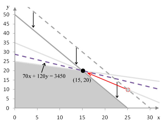
Figure 8 – If the amount of time available for assembly and finishing is reduced by 15 hours to 45 hours, the assembly and finishing constraint shifts down. This reduction causes the optimal solution to change to (12, 20).
For instance, if only 45 hours are available for assembly and finishing, the optimal solution is to produce 12 frame bags and 21 panniers. All of the cutting time and assembly and finishing time is fully utilized, but the capacity is underutilized since only 33 products are being produced.
These changes can be summarized by saying that the total amount of time for assembly and finishing time can be increased above 60 hours an unlimited amount without affecting the optimal solution. But if the total amount of time for assembly and finishing is reduced by more than 10 hours below 50 hours, the optimal solution will move to a new position.
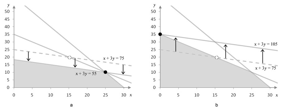
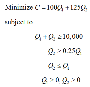
Precautions must be taken when interpreting shadow prices. Shadow prices are valid for the optimal corner point over a range of changes to the constant in a constraint. In the standard maximization problem we have been examining, we can increase the amount of time allotted for cutting by 30 or decrease the amount of time allotted for cutting by 20 and still change the profit 45 for each 1 hour change in cutting time.
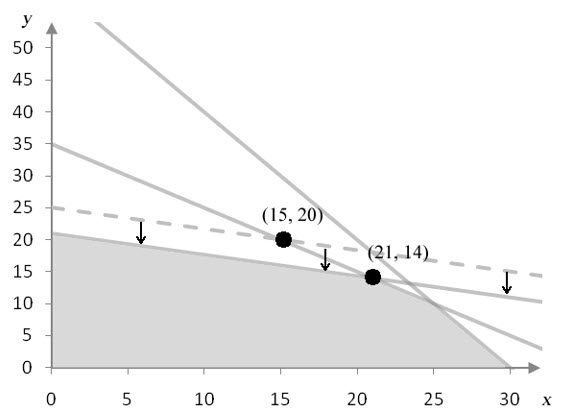
Figure 9 – In graph a, the constant in the second constraint has been decreased from 75 to 55 and the optimal corner point is relocated from (15, 20) to (25, 10). In graph b, the constant in the second constraint has been increased from 75 to 105 and the optimal corner point is relocated from (15, 20) to (0, 35).
As long as the constant on the right hand side of the second constraint varies from 55 to 105, the same two constraints are binding. Any values outside of this range changes which constraints are binding. This occurs because the optimal corner point no longer falls on the border of the cutting constraint and the capacity constraint.
Recall the linear programming problem for the contract breweries from sections 4.2 and 4.4:
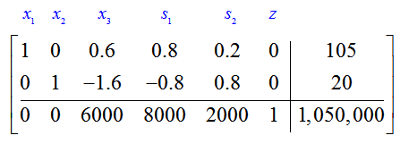
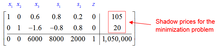
In this problem, we wish to minimize the cost C of producing barrels Q1 of American ale from brewery 1 and Q2 barrels of American ale from brewery 2. The final simplex tableau for this problem is
Shadow prices for standard minimization problems are found in a different location of the final simplex tableau. The solution to this problem, (Q1, Q2) = (8000, 2000), is found beneath the slack variables in the indicator row. The shadow prices are located in the first two rows of the last column.
The shadow price for the production requirement is 105. If the production requirement of producing at least 10,000 barrels is increased by 1 unit to 10,001 barrels, the total cost will increase by $105. The shadow price for the constraint -0.25Q1 + Q2 ≥ 0 is 20. If the right hand side were to increase by one unit from 0 to 1, the total cost would increase by $20. Changing the right hand side of Q1 – Q2 ≥ 0 by 1 unit does not change the total cost.